This holiday season, everyone is hoping on the bandwagon. The question is: are they doing it effectively?
I want to talk about two very unlikely players in the Valentine’s Ad game: Wix.com and Namecheap.
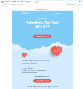
Message: It’s Valentine’s Day so we’re doing a random 50% off discount.
Layout: Simple and clean
Call to action: Clear and eye-grabbing
Incentive: Time’s running out/Hurry this offer ends soon!
Evaluation: Customers are constantly bombarded with messages. If an advertiser sends a message with all of the information that they wish to relay, the potential customer will not read any of it. For this reason, I think Wix.com’s simple and clean layout is very effective. My biggest criticism about this email marketing campaign is that it feels fake. What does a sale for an internet site have to do with Valentine’s day? My suggestion would be to add something along the lines of “Check out these love blogs Wix.com users have made!”
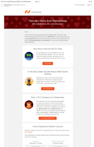
Message: Here’s our monthly newsletter. Check it out to see how you can improve your website!
Layout: Clean, if a little outdated. Nice overview paragraph at the beginning.
Call to action: Clear but can be more effective.
Incentive: Free domain. …and who doesn’t love free things?
Evaluation: To me, this email seems less like they are trying to sell me something that I don’t need and more like they are trying to engage with the consumer. One way to make this campaign more successful is to change “Follow us on Twitter” to “Win a .love domain”. By highlighting what the reader might gain from that action, they’re are more likely to actually complete it. Finally, the layout is very well organized but the colors are not very exciting. Changing some of the colors, like the old lady red color in the banner, might add that visual appeal to entice the reader to scroll down.
Anyway, these were some quick evaluations of email marketing campaigns that I received. Feel free to comment below with any other suggestions that you may have!

