Modeling Customer Satisfaction to Agency Performance
To apply all the skills learned in the MSc Big Data Analytics for Business program at IESEG, the program culminated with a semester-long group consulting project with one of the school’s partner companies. My team’s goal was to model the relationship between customer satisfaction and agency performance using R (code, Shiny and Markdown) to provide our client, a well-known French bank, with actionable solutions. Due to the skewed nature of the data, a strong relationship did not exist between the customer’s satisfaction score and their purchase patterns. Thus, we proposed ways in which our client can obtain more reliable and representative data for future analyses. Nonetheless, we analyzed the survey data to see what important information was evident. We also modified the goal to one where we simply modeled what type of consumer behavior leads to higher purchasing patterns in order to help agents decide on which clients they should focus their selling efforts. We also looked at the data on the agency level to see which type of characteristics typically resulted in a better performing agency in order to help top management determine which agencies might falter in the year to come, thus being able to help those agencies meet their targets. Unfortunately, as this is real and sensitive data, none of the reports, intermediate presentations or codes can be shared. However, you can view the final business presentation to the right.
Predictive Analytics using R
Aside from the final real-world consulting project, we worked on several smaller course projects that were again carried out on real data but not as a direct consulting project. One such project involved creating a predictive model using R (and SQL) for a charity organization to determine the set of donors who are most likely to respond to a retargeting campaign and to donate more than 35 EUR. Additionally, we ran a profit analysis in order to determine what percentage of their donor base they should contact in order to earn the highest profit. You can see the results of our forward stepwise regression, our cumulative gains curve, our lift curve, our predictor insight graphs and our profit analysis on our presentation on the right. Moreover, feel free to contact me if you wish to see the R code.
Python Program for Competitive Analysis
In our Python class, we were given the task of creating a simple Python program to try to “sell” to the class. As someone pursuing a career in marketing data analytics, I thought that it would be interesting to solve one of the problems in that field. I thought back to my various marketing internship experiences and settled on a Twitter mining program to help with competitive audits as well as with monitoring the health of the brand (not limited to company brands but also the brands/reputations of public personalities, such as President Macron). The Python program creates a report (see right) that includes a sentiment analysis, engagement metrics (i.e. retweet and likes), popularity metrics (i.e. tweet amount) as well as a word cloud. It also creates an Excel data table with all of the tweets and attributes gathered for the report for data drilling when necessary. Read more about the intended purpose of the program on my blog post about Twitter Listening for Competitive Audit.
Yelp Company Analytics Using Tableau
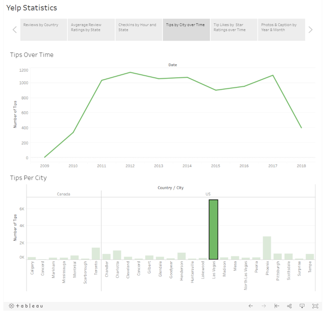
In my Reporting Tools course, we were tasked with analyzing several datasets with information about reviews for 5000 businesses. To complete this project, I used SQL (on the SAS platform) to clean and organize the data and Tableau for the final deliverable. I combined and drilled down into the data to get a better understanding of how the various factors impacted Yelp reviews. Thanks to Tableau, I was able to create a nice story where the users can explore the data even further thanks to the filters.
Predicting Online Engagement
For the Social Media Analytics course, my team and I decided to create a model to predict the probability of user engagement on Twitter in the Sports Apparel Industry. Using text mining, we grouped tweets based on topic (i.e. topic modeling) and based on sentiment (i.e. sentiment analysis). One of the challenges that I decided to take on was to create an emoji dictionary to get a better reading of the sentiment, given that social media is laden with emojis to convey meaning. Those measures were combined with other tweet metrics in a basetable to train a predictive model of the relationship to online user engagement (i.e. likes and retweets). To present our findings, we created an interactive R Shiny as well as a data manual using R Markdown. To see how I coded the sentiment analysis and the regressions, please feel free to contact me.
Wine Clustering using K-means and Agglomerative Clustering
For the Descriptive and Predictive course, we were tasked with various small exercises to practice clustering (to perform segmentation and profiling). Given my interest in unsupervised machine learning, I found a wine dataset on Kaggle to practice the tools that I learned and to complete the more theoretical knowledge gained from the course. I used the sklearn and scipy packages on Python to perform both hierarchical and non-hierarchical clustering. In my analysis, I made use of a dendrogram, factor analysis, PCA for visualizations and ANOVA. Based on the factor analysis, I determined that the thirteen metrics that described the wine loaded on around three main factors. To see whether my clustering was well done, I combined the predicted targets with the three main components and created an interactive 3D scatterplot using Plotly (see right).
Finally, I analyzed these three clusters and created a report using Plotly Dash. If you would like to view an interactive report, feel free to go to my github page to download the code and the data to run the report on your system.
Next steps for this project: Deploying the Dash app online using Heroku.
Exploring Networks and Maximizing Influence
In this age of relationship marketing, a marketer’s primary goal is to understand how their target market network behaves in order to determine the best way to influence their behavior. During the Social Network Analysis course at IESEG, we received an in-depth introduction on the different aspects of networks, including centrality measures, ERGM, community detection and innovation diffusion. For our group project, we analyzed the Game of Thrones character network to determine the signatures that drive the edge (or relationship) formation of that network. Then, we analyzed the centrality of the various nodes (or characters) to determine which characters are the most or the least embedded. Here is the report of our findings.
I wanted to dig deeper into networks to not only understand their structure but to also see how they could be used to spread information most efficiently. I looked at two different influence responses–diminishing returns and threshold–and how they are used to simulate information propagation. Finally, I explored a greedy algorithm that aims to find the seeds that optimize the amount of information propagation. If you would like to discuss the intersection of network analysis and marketing, please do not hesitate to contact me. Meanwhile, here is the short report that I wrote based on my findings.
Creating Recommendations for Online Streaming
For this project, we put together everything we learned about item-based and user-based collaborative filtering as well as about content-based recommendation systems to create a program that will recommend songs to users. Then, we evaluated the various recommendation systems using MAE and F1 to create the most effective one through hybrid recommendation systems. Finally, we used pyspark and Flask to push the code to an API.
Kaggle Competition – Predicting House Prices
Using the housing data provided, we used R to run various machine learning algorithms, such as XGBoost, lasso regression, random forest and others, to solve this regression problem. We compared the RMSE scores and the adjusted R-squared of the seven models to determine the simplest model with the largest predictive power. In the end, it was the XGBoost and the lasso regression that performed the best and landed us at the top 25% of the leaderboard. To get an overview of the project, feel free to look through our presentation on the right.
Seasonal and Non-Seasonal Timeseries Forecasting
Time-series forecasting is important for many industries. Forecasting time-series helps stock brokers in predicting future prices as well as businesses in predicting future income. More specifically, in this report, I looked at time-series for manufacturing output turnover, for average yearly housing prices in Belgium and for average US temperatures. I used various models, including Holt-Winters, ETS and ARIMA, to find the model that best represents the future data. Finally, I chose the best model for each of the three scenarios based on the RMSE measure.
Descriptive Analytics in R with Shiny
As a team, we were tasked with creating a Shiny app that summarizes all of the interesting groups from a gambling dataset. We created a basetable using dplyr and user-defined functions to create metrics such as loyalty. We looked at those metrics as well as at the given demographics to better understand the types of gamblers. To ensure longevity, we created a data manual using R Markdown to give an overview of the gambling groups and to explain all of the variables created. Finally, we created an R shiny app to give an interactive overall picture of who the gambling consumers are.
As always, feel free to contact me if you wish to see the R code.
Optimizing Product Delivery
 With ever increasing competition, companies are now looking for ways to not only earn the most revenue but also to have the least amount of costs. We created a simulated business problem where a French shoe company seeks to find the most efficient and cost effective way to deliver its products. In this project, we used a software named AMPL to find the optimal solution calculated using our objective function and various constraints (such as capacity). Moreover, we created some parameters to determine whether or not the company would benefit from an extra warehouse. To see the final result, feel free to download our report.
Automating Dashboards with VBA
For my Advanced Spreadsheet Analysis course, we had to think of a business problem to solve using VBA in Microsoft Excel for our final project. This prompt was very exciting to me because I had always been looking for a way to automate some of the tedious and repetitive tasks from my previous internships. One of those tasks which involved such tasks was the monthly dashboards at Wunderman. Every month, we would scramble to get all of the data from Google Analytics transferred to our dashboards, made on Excel. As a result, we never had the time that we wanted in order to complete as in depth analytics as we hoped. For this reason, I was looking forward to automating some of data transfer in order to have more time for the human-intensive process of analytics. If you would like to see the Macro-Enabled Microsoft Excel document that we coded, please feel free to contact me.
Feel free to explore my Certifications here.