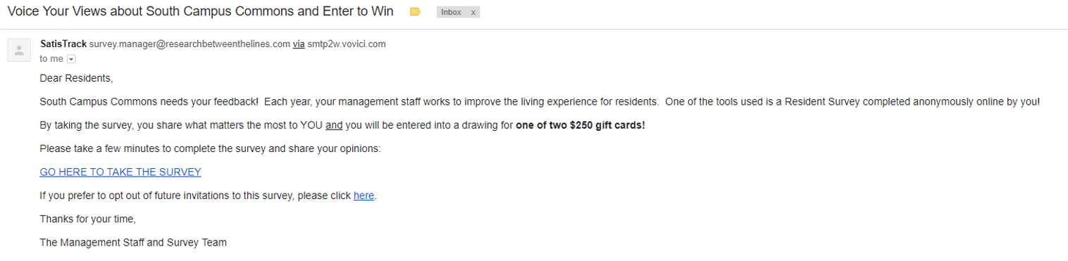
 The other day, I received an email from the apartment management seeking my feedback. This was the world’s most unimpressive email. It lacked any sort of visual appeal. It had no color (other than for the hyperlinks) and absolutely no pictures. The only techniques used to show emphasis were a couple differences in font. Most notably, the phrase that stuck out to me once I opened the email was “one of two $250 gift cards”. This was bolded and was by far the most emphasized part of the email. And rightly so. It was the hook. It was what you might get if you helped out and completed the survey.
The second most eye-catching part of the email was the hyperlinked and capitalized link to the survey. This was their CTA. Most likely the blandest CTA that I have ever seen. The beauty of it was that it didn’t matter. The apartment management knew its audience: college students drowning in student debt and otherwise broke. So, this email accomplished everything that a good marketing campaign aims to do: (1) it enticed the recipient to be interested in the email and (2) it provided easy access to the desired action.
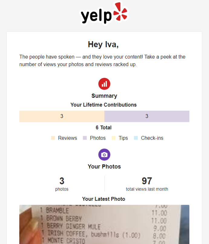 College students don’t really need anything fancy. All they need is a chance to win some money. Notably, I received a notification the other day where Google asked me for some “human feedback” to increase the volume of reviews of a gym that I had just walked out of. It targeted me at the right time and with very cute, hipster messaging. Yet, I didn’t care. The only thing that I would receive from completing that feedback would be the warm, fuzzy feeling for helping someone make a decision of whether or not to go to the gym that I went to regularly. Similarly, I received a reminder marketing email from Yelp to encourage me to use the app and upload more reviews because “the people have spoken –and they love [my] content”. This marketing piece appeals to my ego and desire of being respected by my community. And yet again, I did nothing. I have a group of friends who respect my opinions. What I don’t have is money to go out with that group of friends.
Therefore, while the ugliest email that I have ever received, the apartment management’s marketing email was the most successful. It realized what the wants and needs of the target market were and it didn’t waste any time with excess frills. What do you think of this email? Would you have filled out the survey?