 On my grocery shopping adventure last week, I decided to fuel the child in me. So I bought some Teddy Grahams. Yet, something looked different. As I hadn’t had the product in a while, I figured that my mind might simply be playing tricks on me. But, when I got back home and noticed the back, I knew for sure that the packaging was different. Gone was the cute little fat teddy bear with no pants on the front and gone was that same teddy bear touting the supposed health benefits of the cookies on the back. Instead, now there is a studious teddy bear on the front and directions for a science experiment on the back.
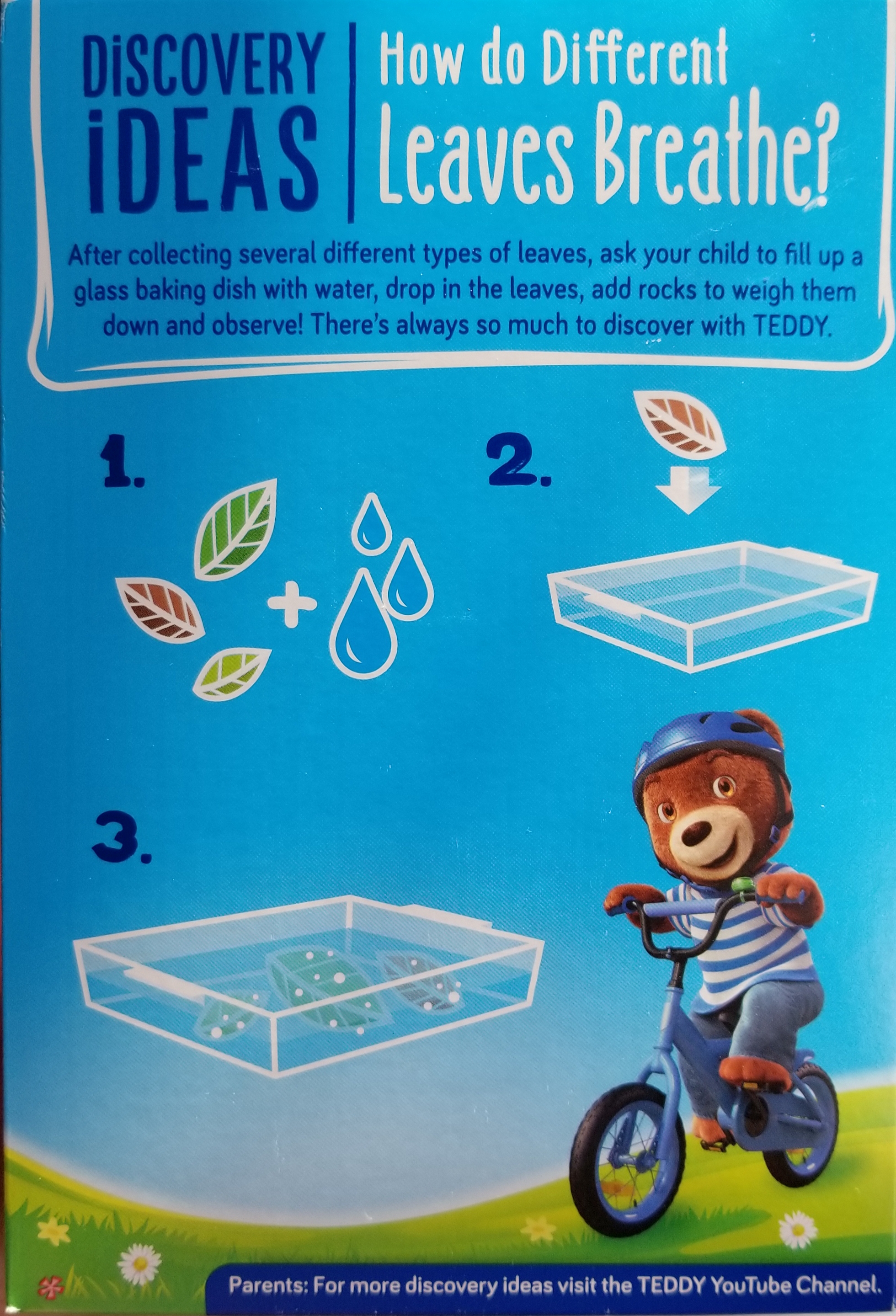
Even though I am not a big fan of the new packaging because it reminds me of school instead of indulgence, I understand why NABISCO decided to change Teddy Grahams’ packaging. Regardless of the fact that the product has essentially remained the same, the new and more fit mascot promotes an image of physical health. This change in character removes the incongruity of the previous slightly chubby teddy bear–thus the unhealthy teddy bear–promoting the bear cookies on account of their health benefits from calcium, iron and zinc. While the CPG company couldn’t change the product to be healthier, it could easily change the packaging to support values held by parents. Furthermore, this new teddy bear is also wearing a helmet while riding his bike, suggesting the importance of physical safety: yet another important value held by parents. Additionally, by having the teddy bear be completely dressed instead of being pant-less, the cartoon character now conforms to the increasingly strict norms of decency. NABISCO doesn’t stop at physical health and safety, though. The most prominent aspect of the back of the box is in fact the detailed science experiment. Through this new packaging, the food company is attempting to subtly create brand loyalty by aligning the company values to those of the consumers.
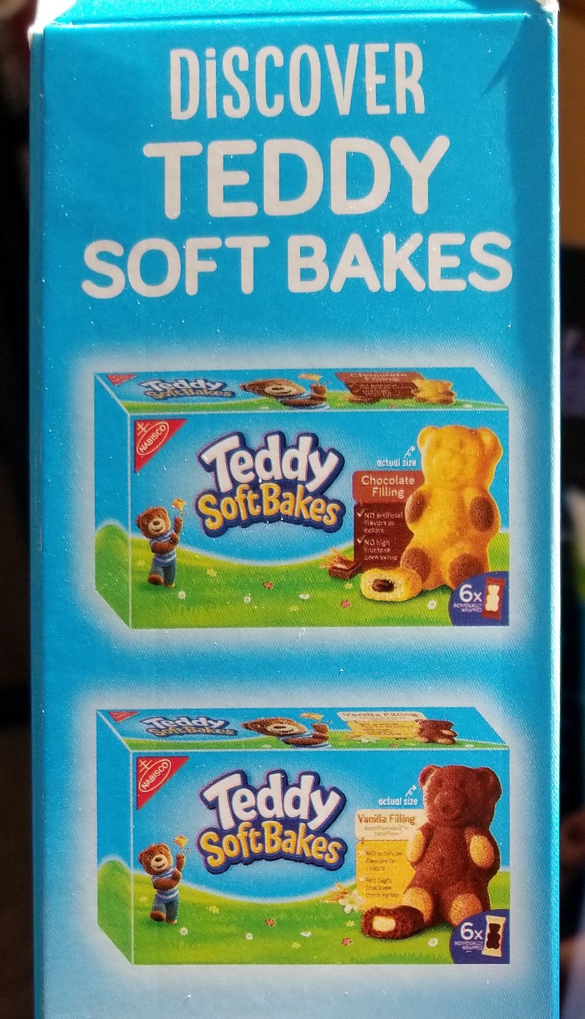 In order to further promote brand loyalty and consideration, NABISCO employs a tactic to increase brand involvement. The blue bar at the bottom of the back panel encourages parents to go online to find other experiments that they could do with their children. This increases the customer’s involvement with the product and makes it more likely that buying the product will become a habitual decision in the future. Once the consumers are brand loyal and purchase the product often, they are more likely to seriously consider other products under the same brand umbrella. It is thus unsurprising that the side panels have also been redesigned and now feature. The CPG company is clearly trying to increase the spend per customer on this brand by reminding parents that there are plenty of additional product options if the child likes this flavor and if they believe in the same values as the brand.
What do you think of this redesign? Does it fool parents into buying the product or is the company simply trying to showcase its values?